Overview
Manulife manages a complex ecosystem of public-facing digital experiences across Canada, the United States, and Asia. Each region operates under different regulatory environments, content practices, and user expectations, yet all must deliver clear, usable, and accessible experiences at scale.
In this project, I worked as a UX Designer to help define and operationalize a scalable design system within AEM Cloud. The goal was not simply to standardize visuals but to embed usability, accessibility, and governance directly into the system. Enabling global teams to create consistent, compliant experiences while retaining regional flexibility
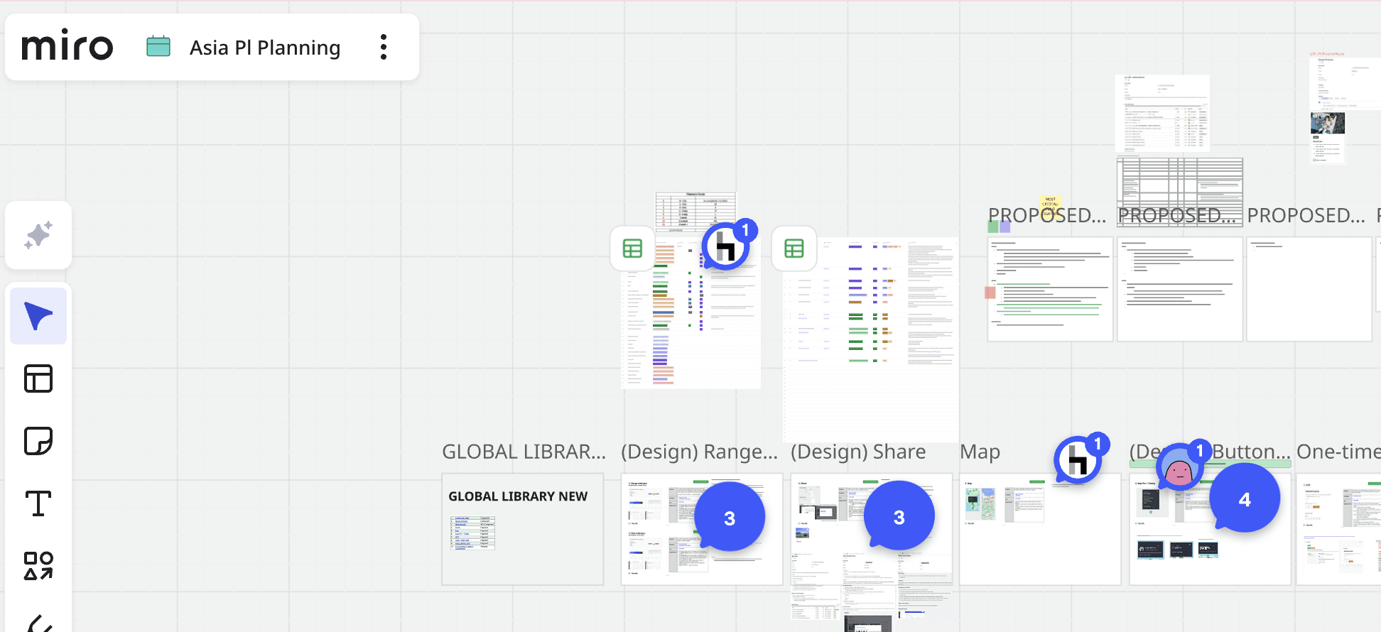
Mapping requirements and pain points for the next sprint in Miro—tracking new fragments, adjustments, and regional inconsistencies to guide the Asia site translation using the AEM library
Challenge
Manulife’s global marketing and content teams manage hundreds of product, informational, and regional pages. Prior to this work, public sites suffered from:
Inconsistent usability and accessibility across regions
Fragmented page structures built from ad-hoc content blocks
High authoring effort and reliance on developers
Slow adoption of global standards due to limited governance
Critically, the issue was not only design inconsistency, it was the absence of a shared global UX and accessibility strategy. That could scale across regions with different needs, regulations, and levels of accessibility maturity.
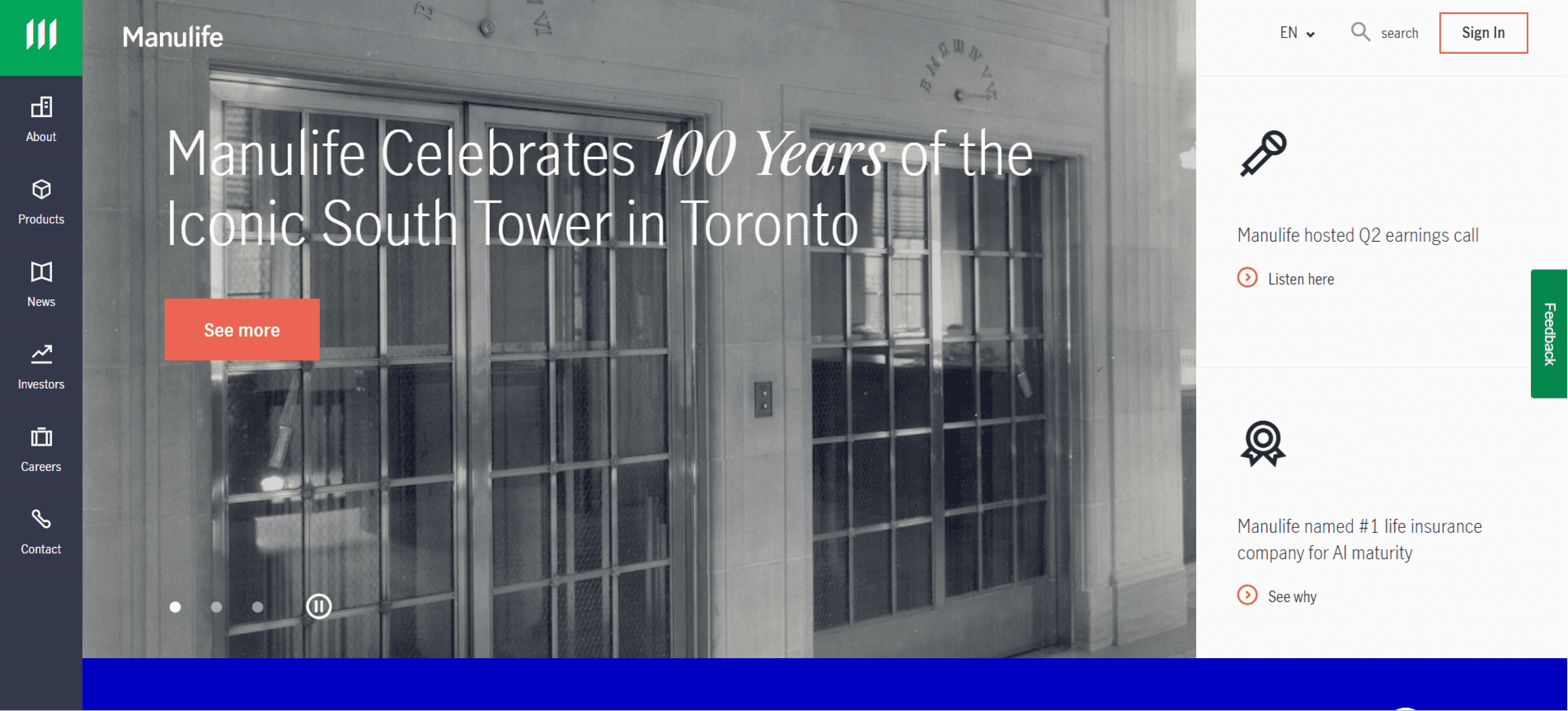
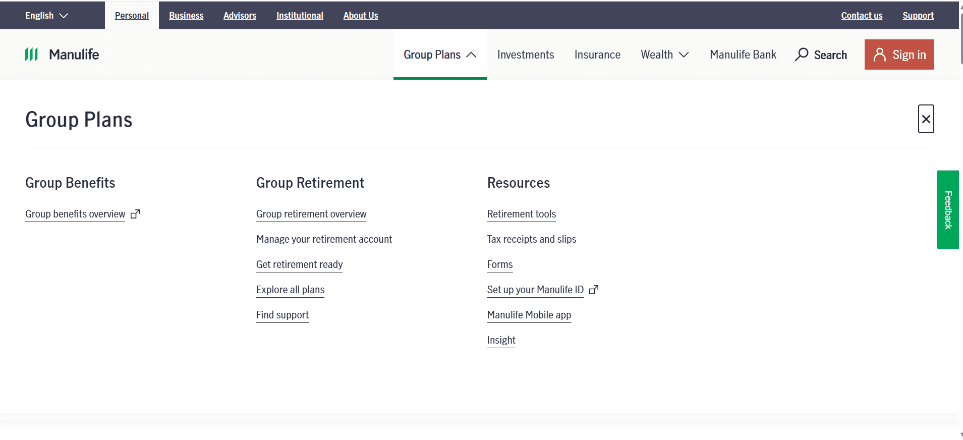
Transparent navigation over the hero image and overlapping chatbot reveal accessibility and usability gaps that our AEM patterns aim to resolve.
Strategy & Approach
Rather than approaching the work as a traditional redesign, we framed it as a systems and governance problem. The strategy focused on three pillars:
Scalability: Create reusable patterns that support global needs without fragmentation.
Accessibility by Default: Embed accessibility safeguards into components so compliance is built into the workflow.
Regional Flexibility: Allow local teams to adapt content meaningfully without breaking usability or standard
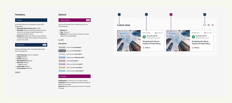
Annotated fragment demonstrating embedded accessibility guidance and variation rules—helping designers implement patterns correctly while preserving flexibility and compliance.
Global Design System
We analyzed existing Manulife pages across regions by breaking them down into discrete content blocks. This revealed recurring patterns alongside significant inconsistencies that negatively affected usability and accessibility.
From this analysis, we defined a set of reusable AEM fragments composed of atomic components. These patterns addressed shared user needs such as navigation, product discovery, and informational clarity.
Scalable Template System
Using these patterns, we designed a library of flexible templates that provided structure without prescribing content too rigidly. Templates enforced consistent hierarchy, spacing, and interaction behaviour, ensuring accessible defaults while allowing regional teams to tailor messaging and visuals.
Using these patterns, we designed a library of flexible templates that provided structure without prescribing content too rigidly. Templates enforced consistent hierarchy, spacing, and interaction behaviour, ensuring accessible defaults while allowing regional teams to tailor messaging and visuals.
Embedded Governance & Authoring Guidance
Each component and pattern was documented in Figma with clear guidance on:
Accessibility considerations
Responsive behaviour
Authoring constraints and best practices
This documentation shifted accessibility and usability from being review-stage concerns to built-in system behaviours, reducing risk and dependency on specialists.
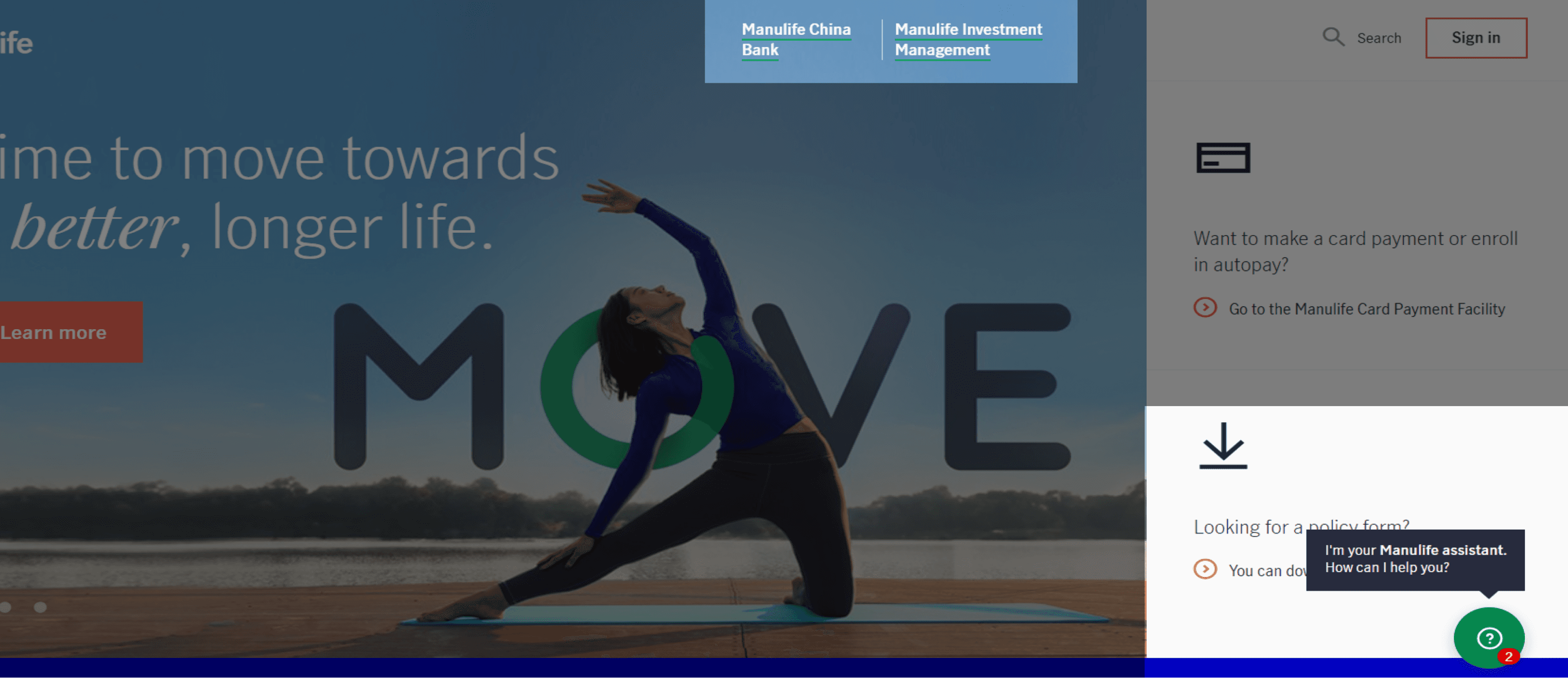
Screenshot of the updated navigation designed to support global accessibility needs—moving from a hidden side navigation to a top navigation with clear focus states.
Global Collaboration & Adoption
As the design system matured, my focus shifted toward supporting global adoption and ongoing evolution of the system. I worked on enabling teams to transition their sites to the shared framework.
This collaboration required understanding diverse regional content needs and user expectations.
For example:
Some regions include more descriptive location details in addition to standard address lines. To accommodate this, we adapted existing patterns to support longer content without compromising layout consistency or accessibility.
Visual hierarchy and content emphasis varied across regions. Certain sites relied more heavily on imagery or promotional indicators to guide user decisions. We extended card patterns to flexibly support richer visuals while maintaining accessibility-safe defaults.
These adaptations reinforced the value of principle-led systems that balance consistency with regional flexibility, rather than relying on rigid templates.
Accessibility Advocacy
Working across regions surfaced additional strategic challenges related to content density and accessibility maturity. In some markets, pages contain significantly more information per view, which can impact readability, focus, and accessibility.
Accessibility regulations and enforcement also vary globally. Compared to North America, some regions operate under different regulatory pressures, which can influence how accessibility is prioritised during design and implementation.
A key part of my role has been advocacy and enablement. Rather than allowing teams to break components to match legacy styles, I worked with regional partners to:
Encourage adoption of AEM’s built-in accessibility safeguards
Demonstrate how accessible patterns improve usability and maintain flexibility
Position accessibility as a shared foundation, not a constraint
This approach helps raise the baseline experience across regions while preserving local expression
The project delivered a design system of 24 components and 7 reusable templates.
Enabling teams to build, edit, and ship pages faster with less author effort and reduced reliance on developers. Through close collaboration with global teams, we adapted patterns to support regional content needs and visual nuance—proving that principle-led systems can scale consistently while flexing locally.
Enabling teams to build, edit, and ship pages faster with less author effort and reduced reliance on developers. Through close collaboration with global teams, we adapted patterns to support regional content needs and visual nuance—proving that principle-led systems can scale consistently while flexing locally.